
Camp Airy & Louise
○ the situation
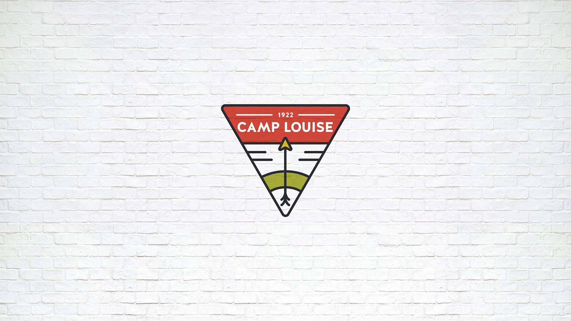
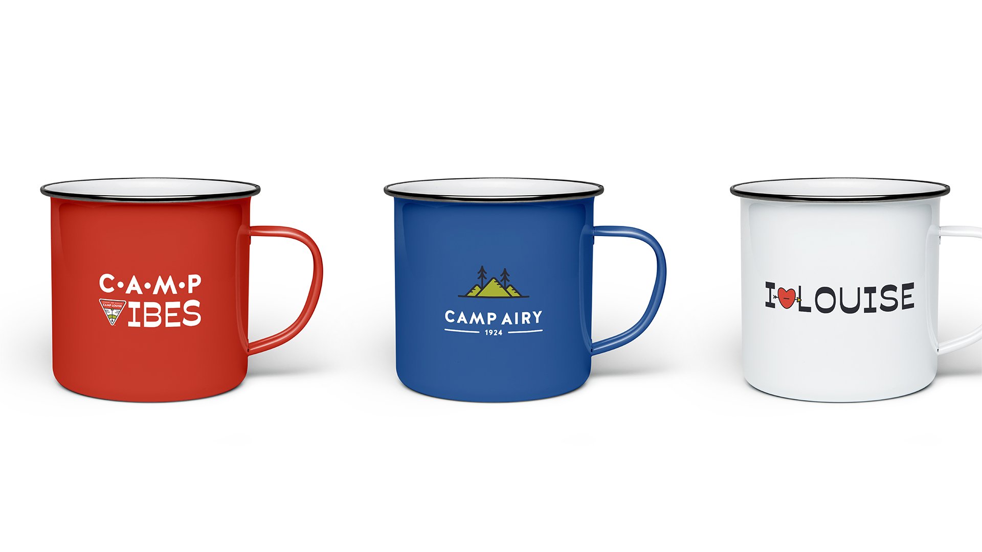
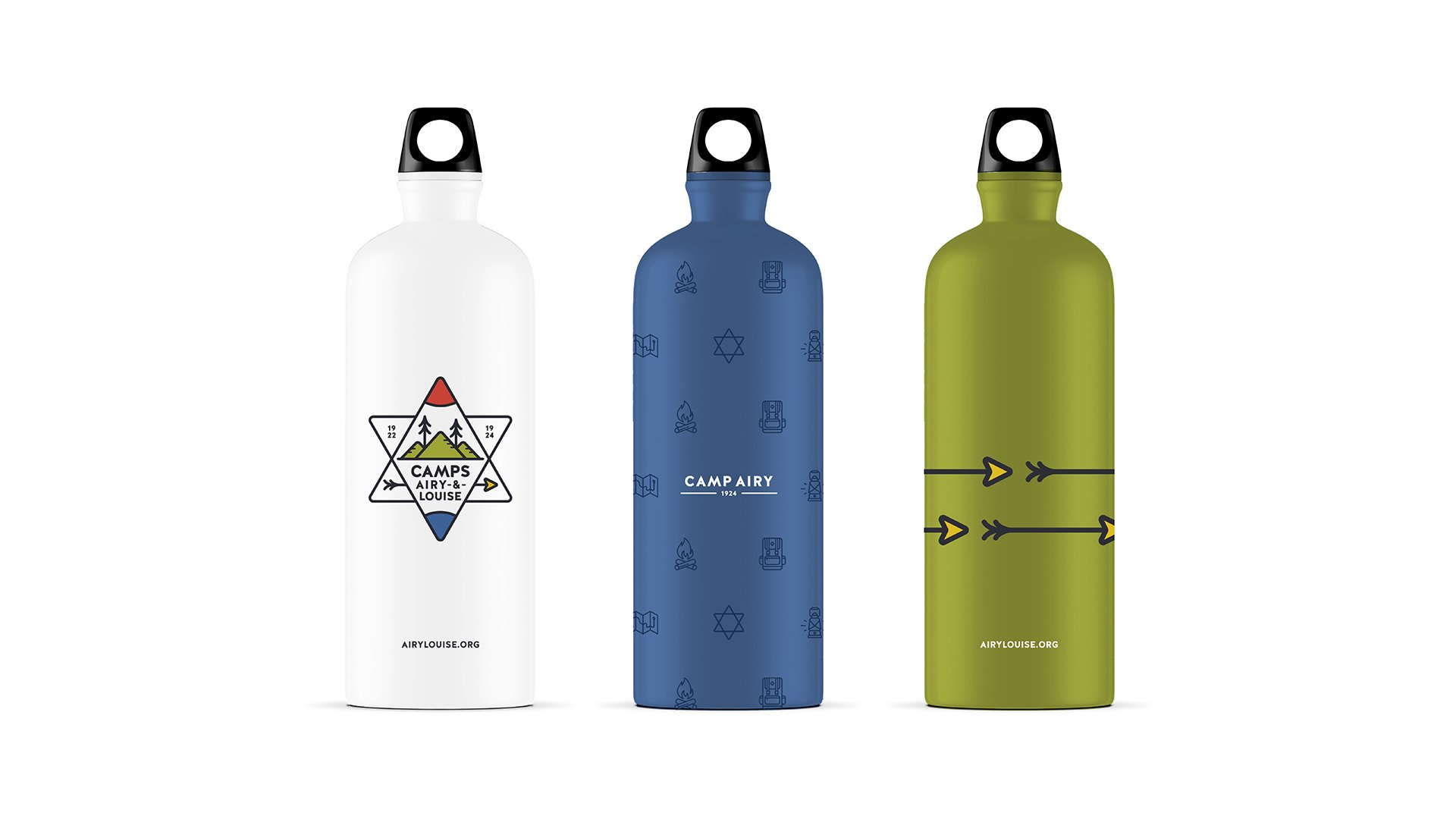
A boys and girls Jewish Summer camp out of Maryland came to us looking for a full rebrand. They were struggling to find ways to separate the camps, while still feeling unified under one umbrella. After visiting the camps, meeting the team and interviewing camp counselors, we learned that the ultimate goal was to have three brands: one boys camp logo, one girls camp logo, and a combined logo for the parent brand.
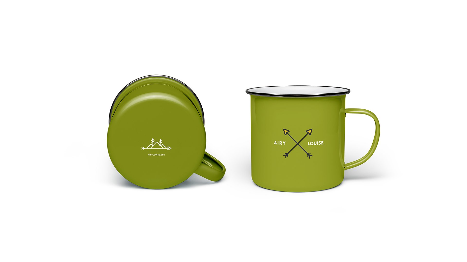
Two Camps. One Legacy.
My role within this project:
Branding
Art Direction
Creative Copywriting
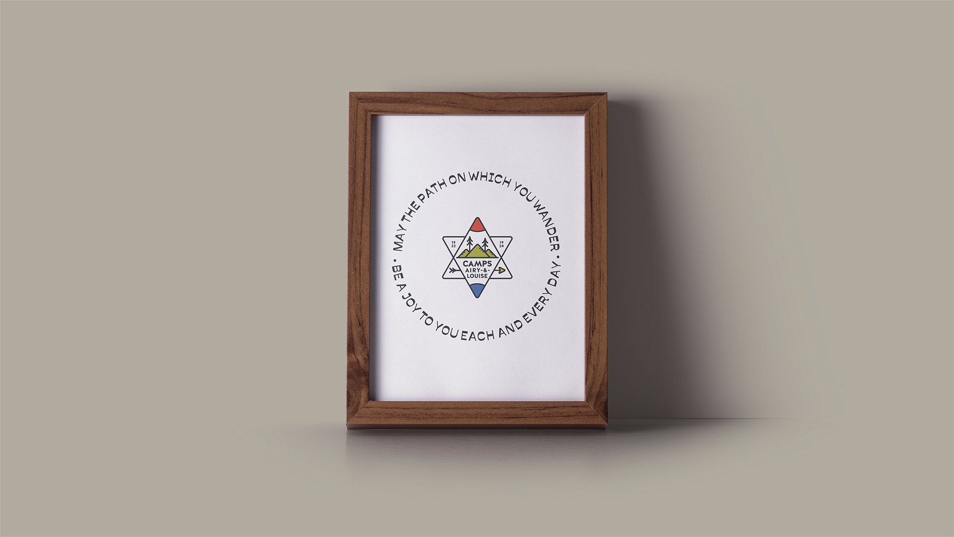
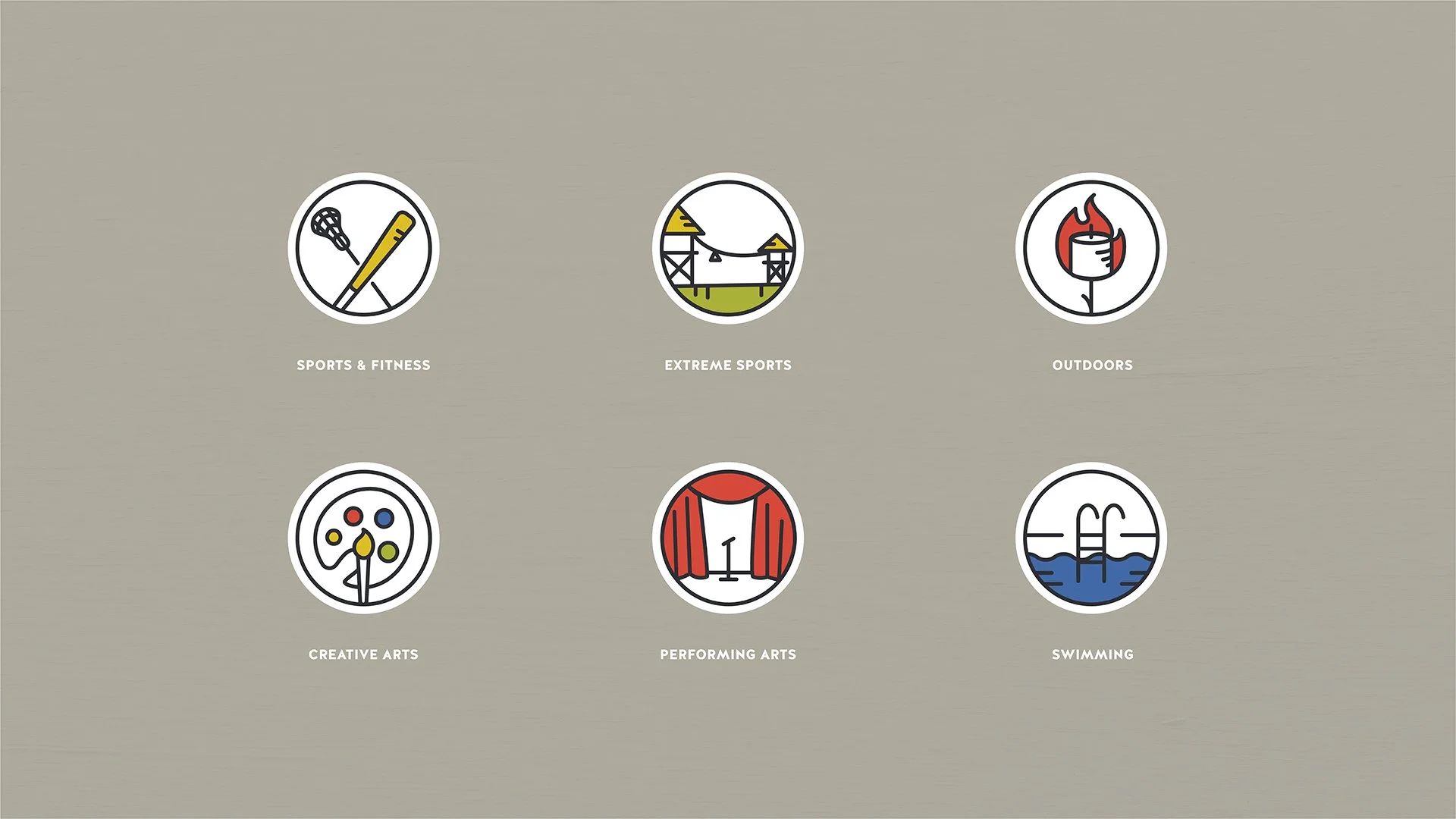
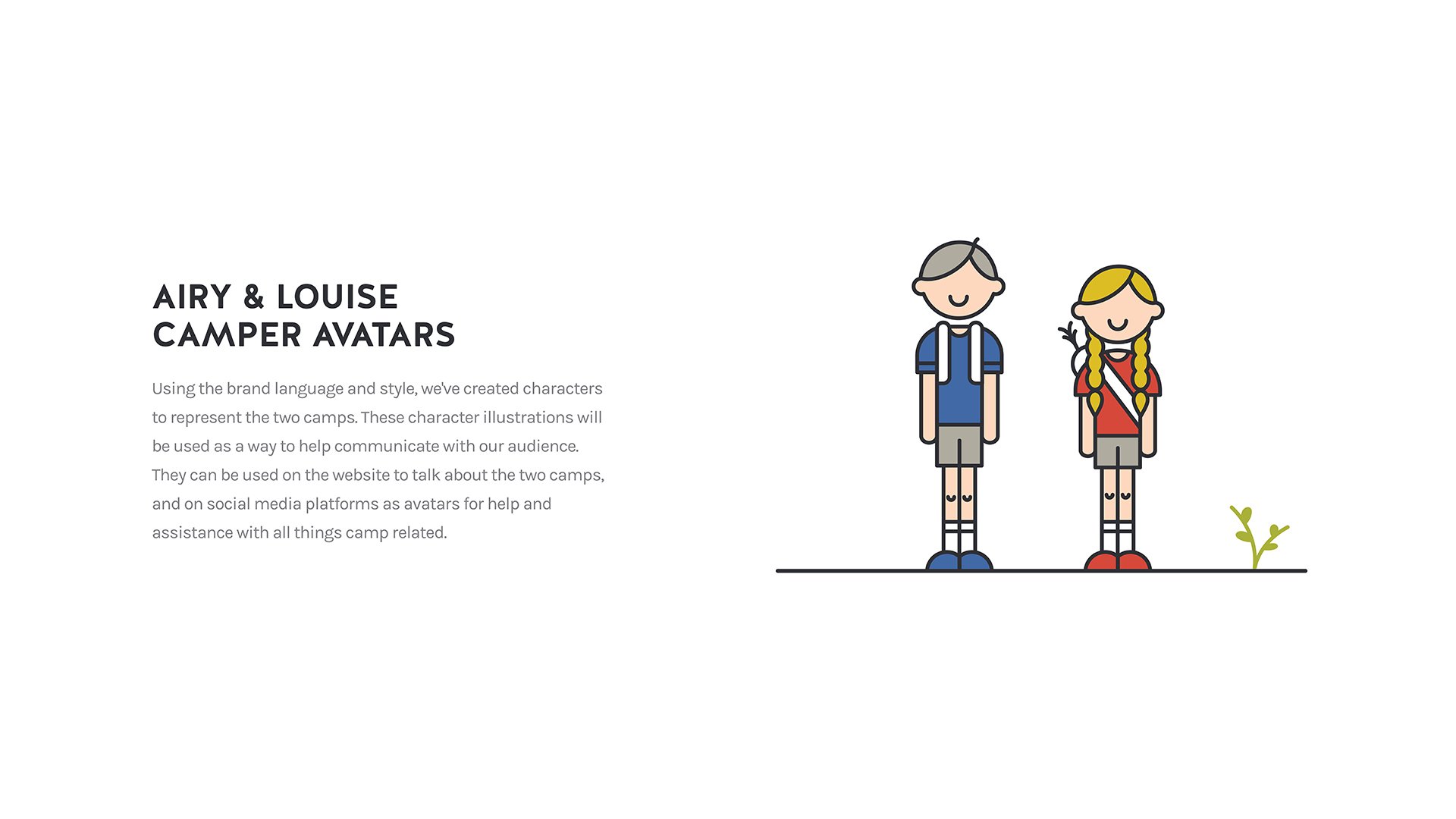
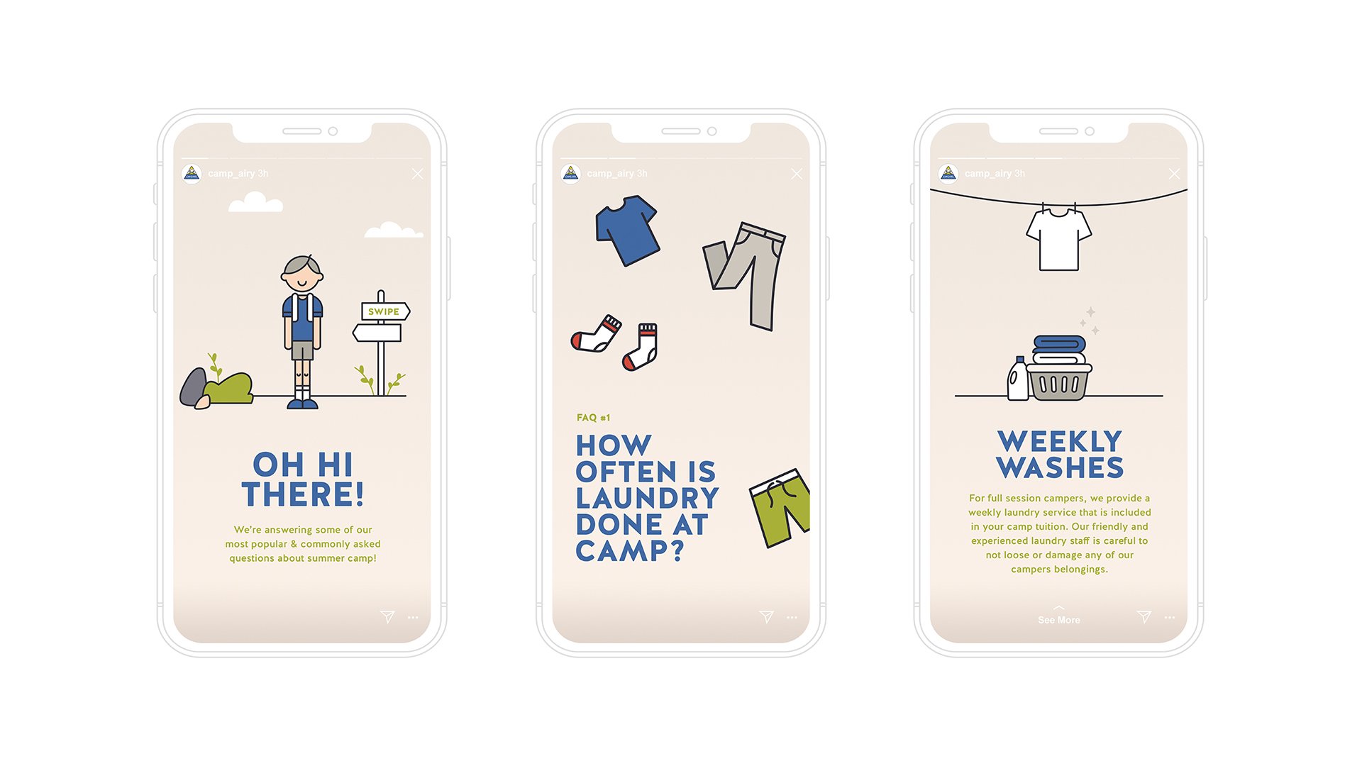
Illustration
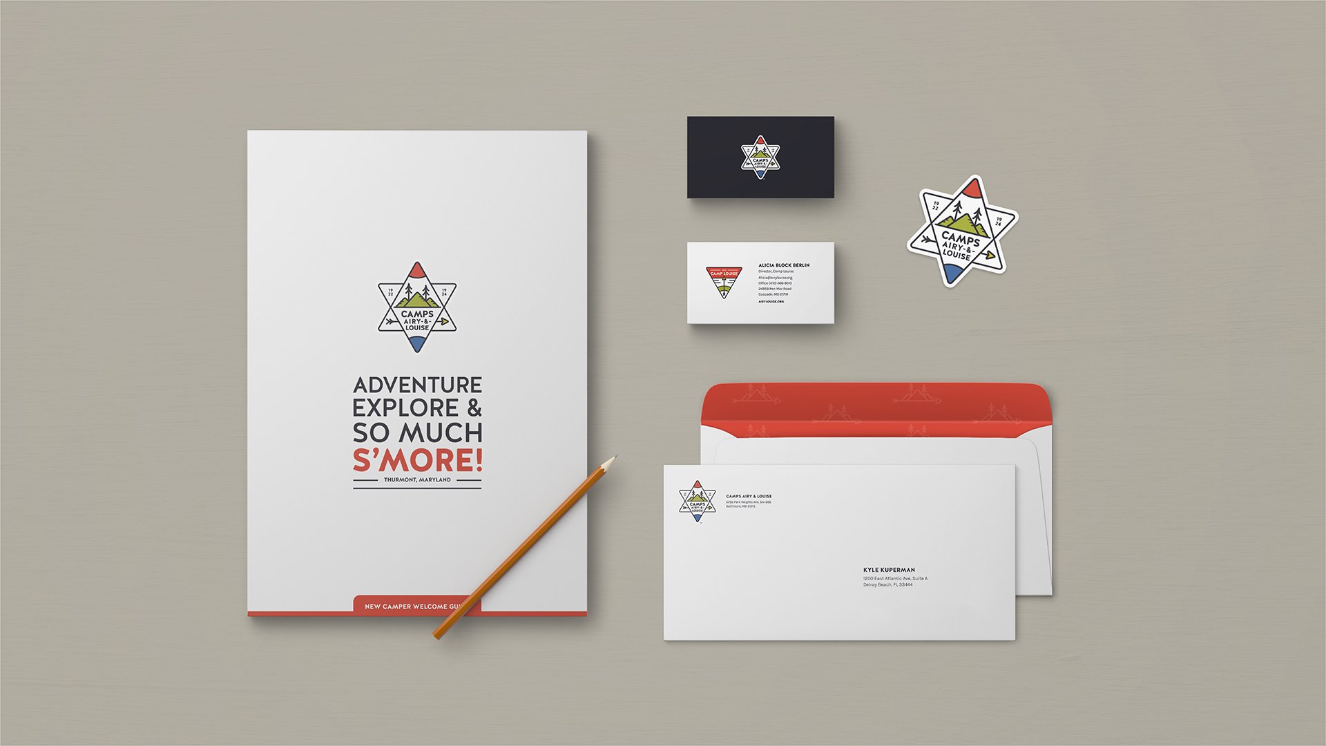
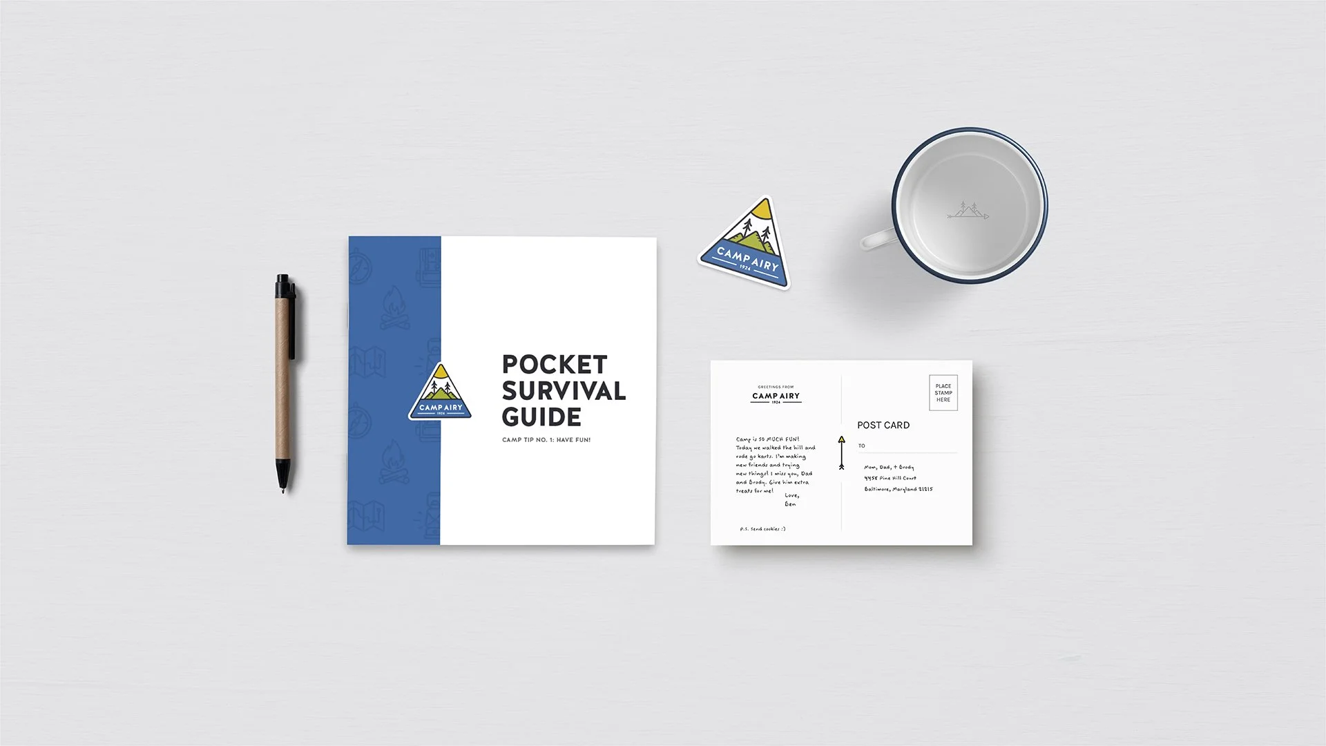
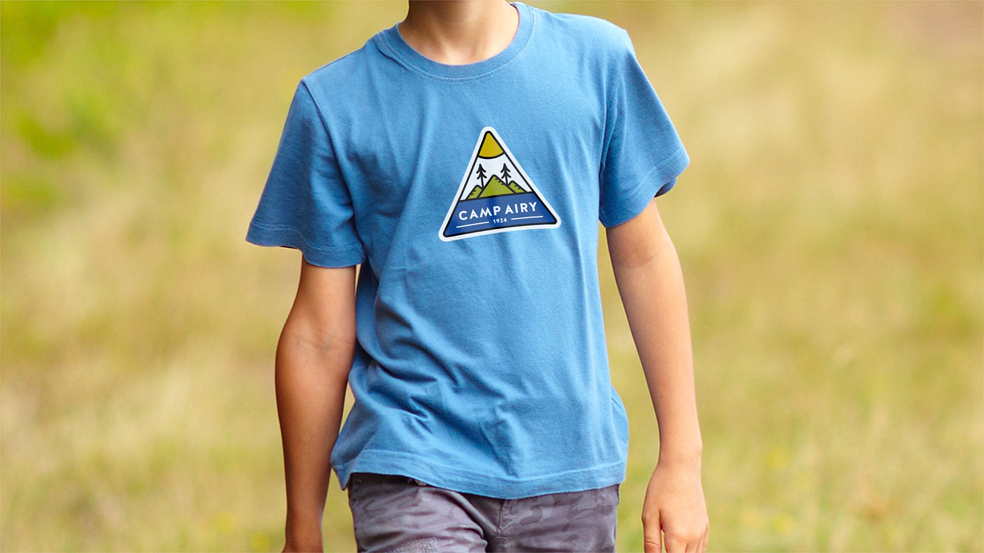
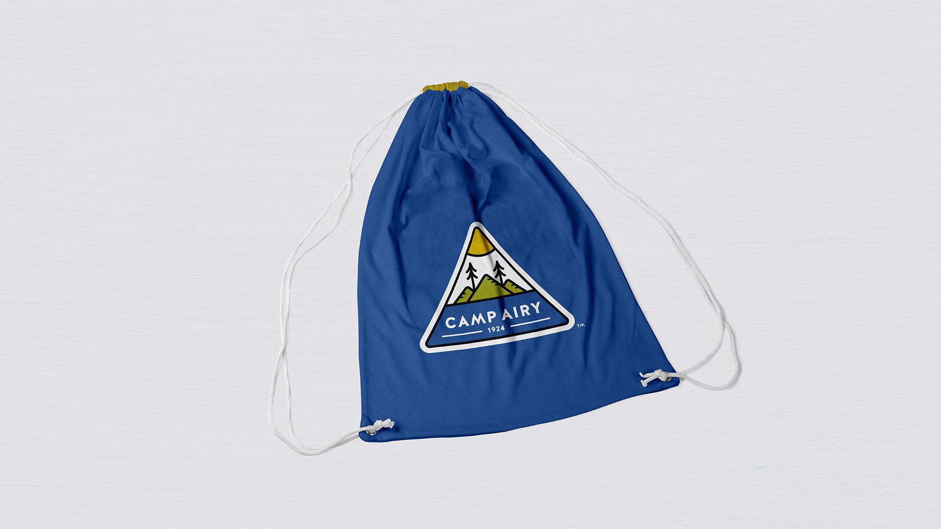
Brand Collateral Design


◆ conclusion
In the end, I was able to develop a rich, thoughtful brand that is full of personality and heritage. The final execution solves the clients need of having two separate brand marks that can come together to form a “combined” logo. Each mark works very well on their own, and when combined, celebrates the Jewish heritage.