

Alexander Appellate
○ the situation
Alexander Appellate Law is a legal firm dedicated to representing individuals, businesses, nonprofits, and government entities in a wide array of appeals, spanning both the State of Florida and federal court. In the intricate landscape of legal systems, the opportunity to appeal arises when parties contest a trial court decision, citing potential errors in the legal process or misinterpretations of the law.
Given the unique and vital nature of appellate law in upholding the legal system's integrity and ensuring justice–my client recognized the need for an improved brand presence. The existing brand faced challenges in terms of distinctiveness and adaptability, lacking the flexibility required for a responsive brand system.
To be one of Florida’s premier appellate law firms.
● the solution
I aimed to develop a visually captivating and flexible identity system that connects with the target audience, effectively communicating the firm's dedication to achieving excellence in the field of appellate law.
My client mentioned being drawn to Wes Anderson design aesthetic, which I found very interesting, and used as a jumping off point for the brand look. Being in Florida, I was also inspired by vintage and classic Florida architecture, a blend of art-deco and classical architecture commonly seen throughout Florida.
My role within this project:
Creative Direction
Branding & Identity Design
Creative Copywriting
Email Marketing


My role within this project:
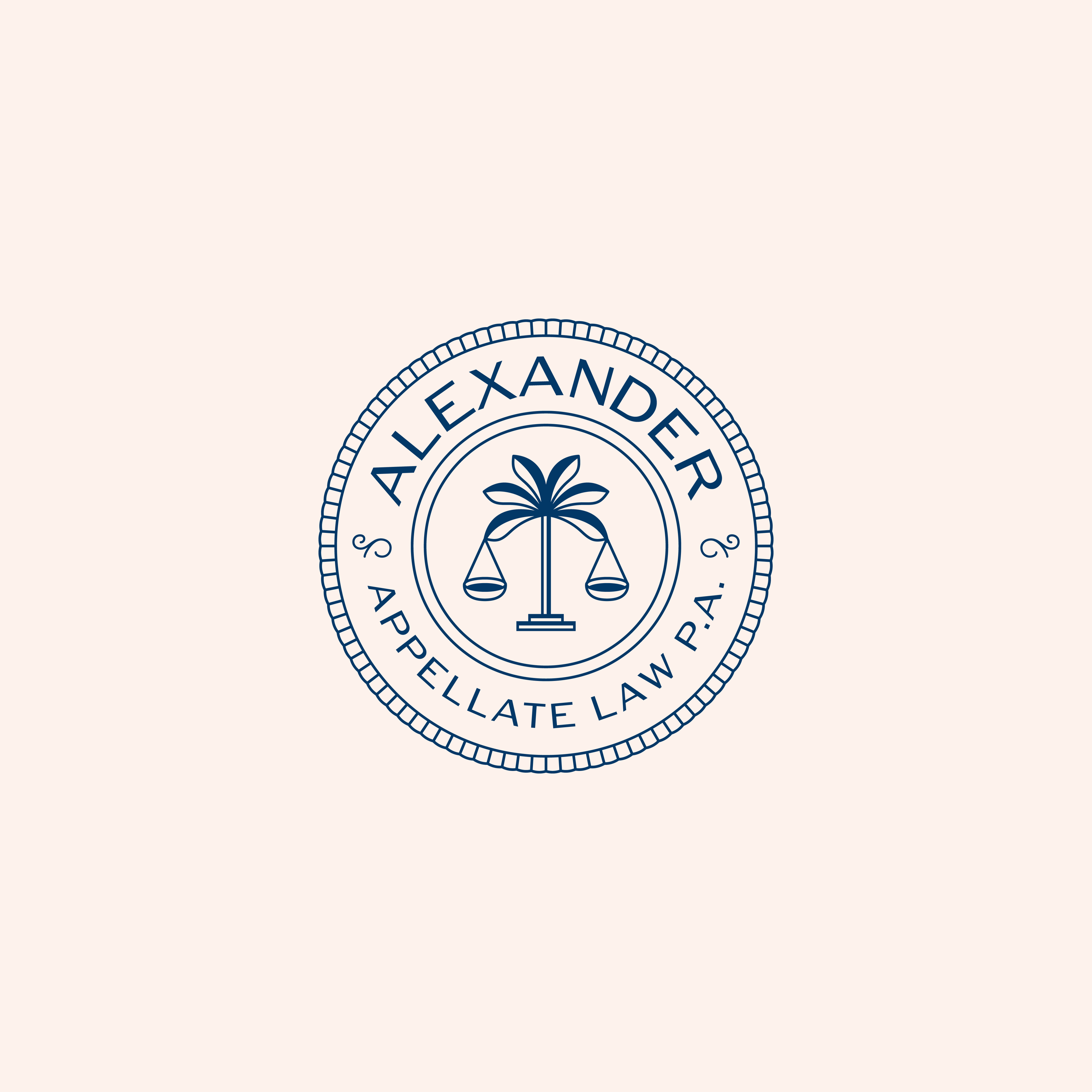
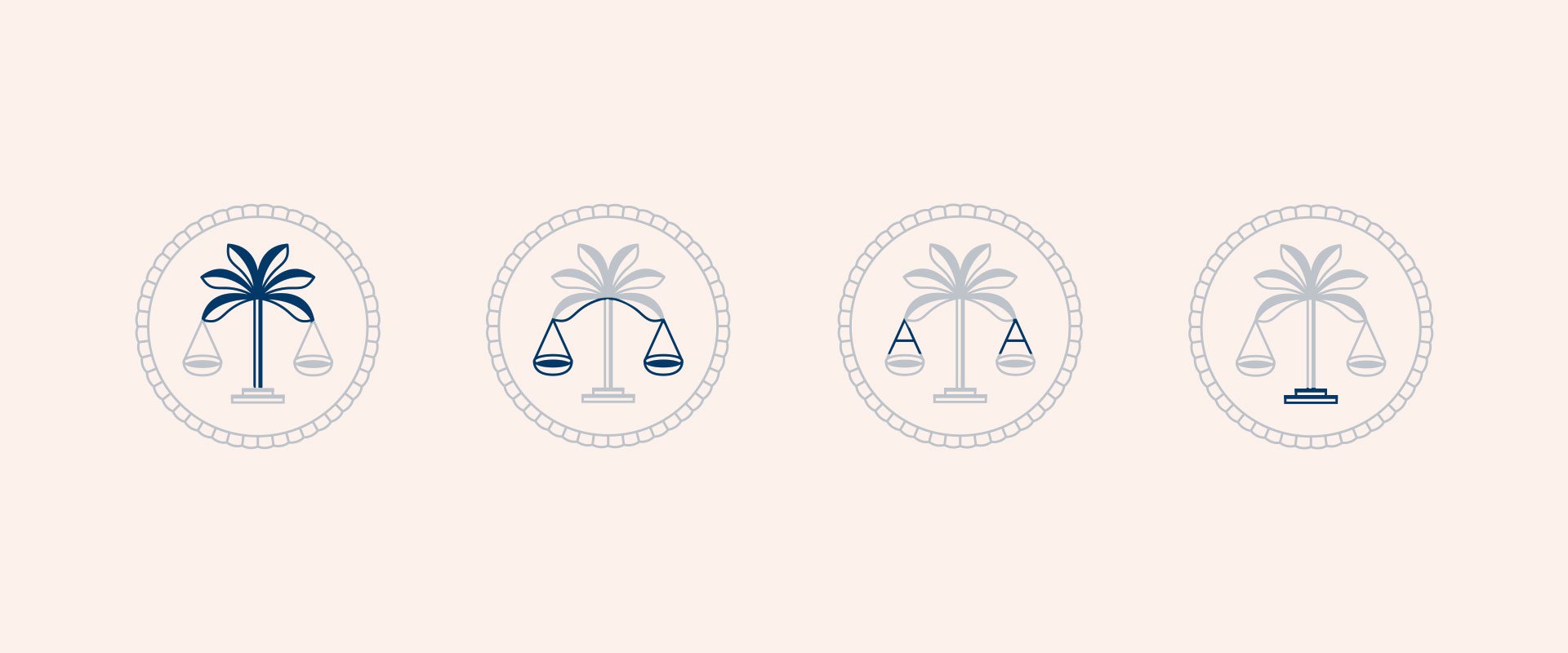
The logo's symbolism is rich and purposeful, featuring an art deco-inspired palm tree as the focal point—a nod to Florida's timeless and iconic architecture. The bottom curve of the palm leaves doubles as the arms of a justice scale, a widely recognized courts system symbol. Diagonal lines connecting the scales reinforce the letter "A," aligning seamlessly with the brand name: Alexander Appellate. The bottom steps provide a strong foundation, guiding the eye upward, strategically directing attention throughout the entirety of the logo, creating a purposeful visual narrative.


◆ conclusion
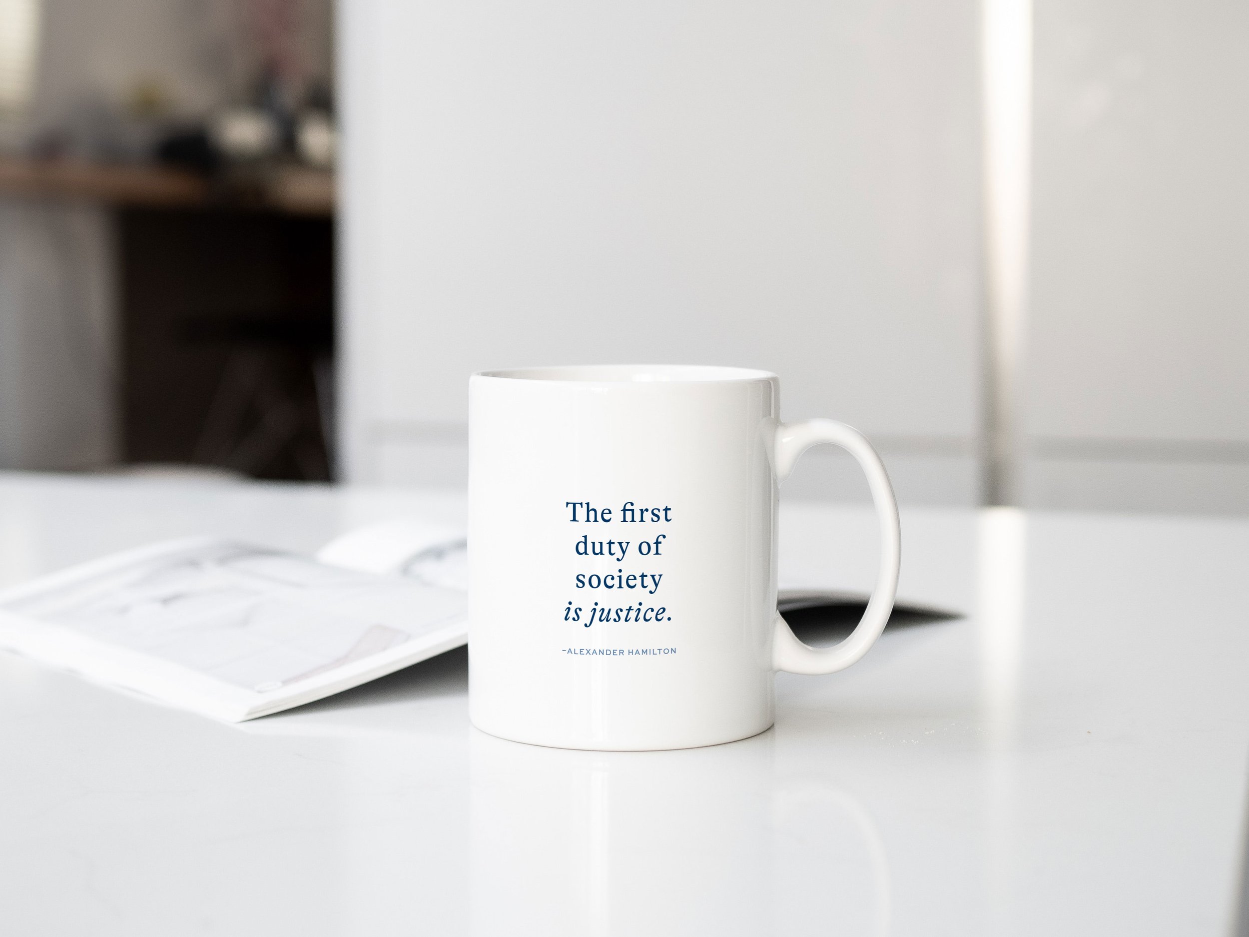
The new brand design exudes a more professional and creative vibe. The color palette strikes a balance between elegance and whimsy, maintaining an overall sense of professionalism. Notably, the brand system has become more flexible, granting the client greater freedom in utilizing different marks. It successfully captures a Florida essence while still fitting within the context of the legal industry. The modernized look represents a significant improvement, and the client is incredibly happy, noting that the brand aligns perfectly with his expectations and vision.
Feedback sent via email from the client:

